Chapter 7 - Visual recommendations
Most recommender systems given e.g. a single movie are able to produce a Top N list of recommendations:
Movie 1
Movie 2
Movie 3
...
In which the numbering (if available) indicates the relative "ranking" of the recommendations, the first ranked recommendation is by the system determined as the strongest recommendation, the third ranked recommendation is weaker than the two above it. Recommendations may be ranked by predicted value, similarity or other similar ranking metrics. In [Figures movielens quickpick topn -- discshop topn ] various versions of Top N lists are displayed based on just a single movie, in [movielens topn] a Top N list is shown based on an entire rating profile.
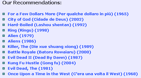
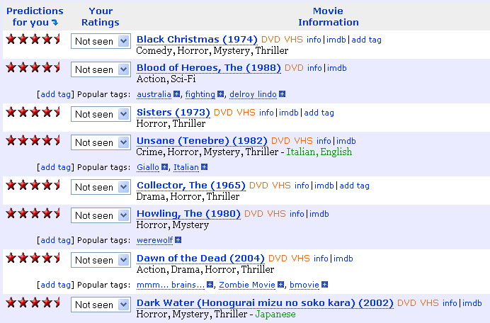
movielens quickpick topn MovieLens QuickPick feature, displaying top recommendations given the movie "The Thing (1982)" (discussed in Part I).
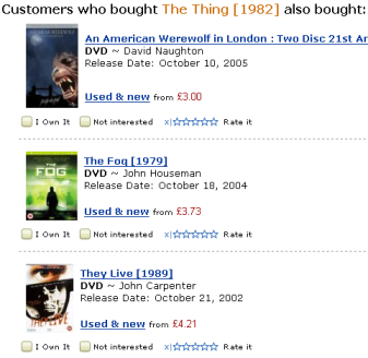
amazon topn Amazon displaying top recommendations on "The page you made" (discussed in Part I) given that I visited the product page for the movie "The Thing (1982)"
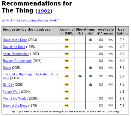
imdb topn IMDB's recommendation center (discussed in Part I) displaying top recommendations for the movie "The Thing (1982)".
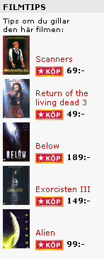
discshop topn Top recommendations displayed on the product page of the movies "The Thing (1982)" of the Swedish e-commerce store Discshop
movielens topn MovieLens "Top picks for you" will displayed a list of movies ranked by predictions made based on a user's entire ratings profile.
Within information retrieval the traditional approach is again to return a ranked list of documents, Google uses a ranking metric termed PageRank [brin98anatomy] to order the retrieved documents in a ranked list [google topn] .
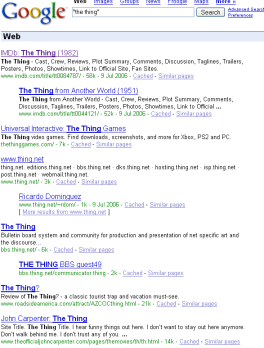
google topn Google documents retrieved using the search query "the thing".
In the traditional 1-dimensional case the user usually focus his interest on the top of the list, and most often that is all that the user is provided with. Providing the user with the entire list of ranked items or documents may prove of little use to the user as it may be hard to judge the relative relevance of items on positions in the middle of the list. This does not encourage the user to explore the recommendation list. An alternative is to display a 2 dimensional list, i.e. a map of recommendations, since there no longer will be any "Top", focus can be put on the explorative part.
As previously discussed in Part II, there are different methods for projecting high dimensional manifolds onto a two dimensional display, the usage of a two dimensional display of document similarity was suggested for use in information retrieval as early as 1969 by Sammon [sammon69nonlinear] . Sammon suggested an experimental system in which a user would examine the 30 highest ranked documents retrieved by the system, the examination would involve looking at the abstracts of the documents and while doing so the user would indicate which documents he considers relevant. Having done this, a scatter diagram [sammon crt] would be shown where each of the 30 documents would be indicated by an I or R depending upon its relevance. In addition the original query vector would be displayed as a Q on the scatter diagram. The user could then examine the relative positions of the documents in the mapping, the user would then select one or more relevant documents to be used to generate new query vector(s). The concept being that a query vector can be moved to highly relevant regions of the document space by interacting at a display console with a geometric representation of the space.
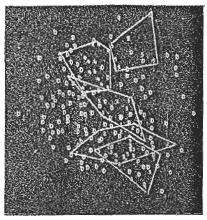
sammon crt A suggested experimental document retrieval system. Given the 30 most relevant documents to a user query, the user can indicate which documents he considers relevant and irrelevant, a sammon mapping (or similar) could then be done of the documents to display their relative location, documents would be labeled as I or R depending on their user decided relevance. The original query vector is also displayed. The user can then make new queries by selecting one or more documents (using e.g. a light pen on a crt display) to base new queries on. The concept being that a query vector can be moved to highly relevant regions of the document space by interacting at a display console with a geometric representation of the space.
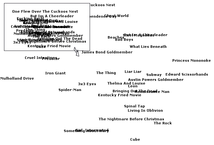
In [silaghi04bidimensional] it is discussed how the automated categorization of texts into predefined categories can be visualized. In a information retrieval system that retrieves text documents, the similarity between documents can then be visualized by showing how similar the categories the text documents retrieved belong to are. It is additionally stated that visual techniques harness human perceptual capabilities to detect patterns and outliers in visual information. A algorithm that visualizes the distances between document categories is presented, a test dataset consisting of 20 different categories (newsgroups) with 1000 documents for each category (posts to each newsgroup) is used. A two dimensional (called bi-dimensional in the paper) display of the categories from the test dataset is displayed in [silaghi newsgroup categories map] .
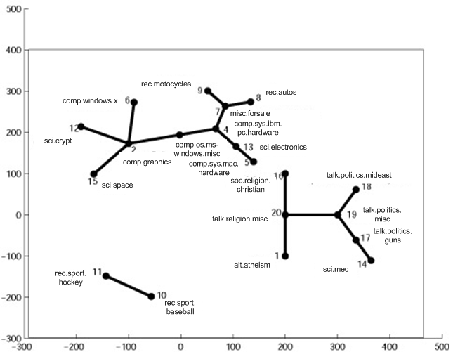
silaghi newsgroup categories map Two dimensional visualization of distances between text document categories (newsgroups).
However, it is not necessary for the visualization to preserve distances, only the documents relative similarity needs be preserved. A information retrieval system for newsgroup documents that visualizes the ordering of newsgroup documents as well as newsgroups using what is referred to as the WEBSOM method is presented in [honkela96newsgroup] . The WEBSOM method uses the SOM algorithm to create two dimensional document maps, this means that distances wont be preserved, however visualization of document similarities will be easy to visualize, as will the discovery of related documents be. A presentation of the latest WEBSOM is given in [kohonen00selforganization] where a two dimensional map of over 80 million newsgroup documents is created. An interface for the WEBSOM map is further described in [lagus00thesis] . The interface is build on the idea of zooming in on the map on locations containing information of interest, labels are displayed on the map to give an idea of the information stored at that map location, and exploring nearby locations on the map once a location containing interesting information has been found [websom] .
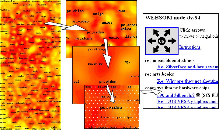
websom The WEBSOM method was used to create a two dimensional map of over 80 million newsgroup documents. The map is visualized as a heat map where dark colors indicate few documents, light colors indicate many documents. The labeling indicates the category most representative for the type of documents contained in the location. At the highest level of zoom no documents are visible, only the labeling which can be used as an indication of newsgroup similarity. Clicking on a location on the map zooms in (in this case in three steps) on the node until finally the documents in the node are shown. By moving to nearby nodes further similar documents can be found.
In [novak03discovering] a information retrieval system for articles is presented, a first application context of their work is the Internet platform netzspannung.org(*) which aims at establishing a knowledge portal that provides insight into the intersection between digital art, culture and information technology. They provide a SOM based visualization system of articles with an exploratory interface [netzspannung] . In their paper they also discuss the concept of personal maps [netzspannung experimental personal map] , the idea being that expert users use their system to find articles within their expertise and interest and add those to their personal map where they themselves visually indicate the articles relative similarity. By comparing personal maps with other user's, the system can recommend personal maps between users. However the idea of personal maps is not further explained (specifically how to compare the maps is not explained) and is only presented as a future work.
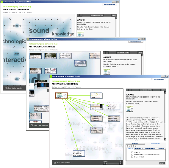
netzspannung Netzspannung interface for exploring similar articles. At the highest zoom only various category labels are visible, however some dots are available that can be clicked to look at a document probably representative for the category. In this case a node containing information on the AWAKE project was selected. By zooming in on the map (which is done by dragging a slide bar) more detailed information is shown on the map about documents in the zoomed in area. By selecting an article and asking for documents similar to it a graph is displayed indicating locations (far or near on the map) containing similar documents. The idea probably being that besides exploring nearby locations on the map for similar documents, the user can jump to seemingly distant locations that still contain documents of some relevance.
netzspannung experimental personal map What is called the "Knowledge explorer system interface" in [novak03discovering] . The upper left hand window is a "content map" with what is called the "concept map" to its right. The content map displays documents while the concept map attempts to motivate the structure that gave rise to the document display. The lower-right hand window displays a personal map, users are able to drag documents from the document map onto it and arrange them as they deem suitable. And the lower-left hand window displays information about the currently selected document.
In [pampalk01islands] the SOM algorithm is applied to music files represented using features of the actual music. Users can then explore the map based visualization "Islands of Music" to find similar music [islands of music] .
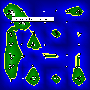
islands of music "Islands of music". A map is created using the SOM that displays music and allows for exploration of similar music pieces. Assuming that the user knows neither artist nor title the pieces of music are represented by white balls instead. Moving the mouse over one of these white balls displays the tool tip (yellow popup) with the artist and title of the song.
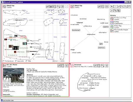
In Gnovies(*) a "rock star approach" to recommendations of movies is taken, based on what is called a cycle where users rate something near 10 movies the system recommends similar movies and displays them using a spring effect that doesn't necessarily indicate movie similarity, but nevertheless displays recommendations on a two dimensional map that can be explored (however exploration is not intuitive as movie neighbourhoods constantly changes) [gnovies] .
gnovies The Gnovies movie recommender system's based on the rock star approach. Showing movies similar to the movie "The Thing (1982)". A spring effect is used where all movies are first bunched together and fly out like a spring to separate themselves, probably without any similarity meaning, though still a neat effect.
Indeed most of the examples presented can be seen as making recommendations, they are after all displaying documents or music similar to some known (selected) document or music. Within a recommender system the traditional Top N recommendation process can be made transparent to the user by displaying recommended items on a map, i.e. showing a two dimensional Top N list [movsom] . Instead of the traditional one dimensional Top N list where the first entries are easy to grasp as relevant and the remaining items harder to judge relevance for and not easy to explore, the two dimensional Top N list's map display will further encourage the user to explore the recommendations since moving around in the map is intuitive and easily understandable. As the only change that has been made is the display of the Top N list, this is termed a visual recommendation which by the use of a visual display adds value to a traditional Top N list while at the same time encouraging exploration of recommendations. By studying any nearby item in the map, its neighbourhood of similar items is immediately visible adding on an understanding for what kind of recommendation it is.
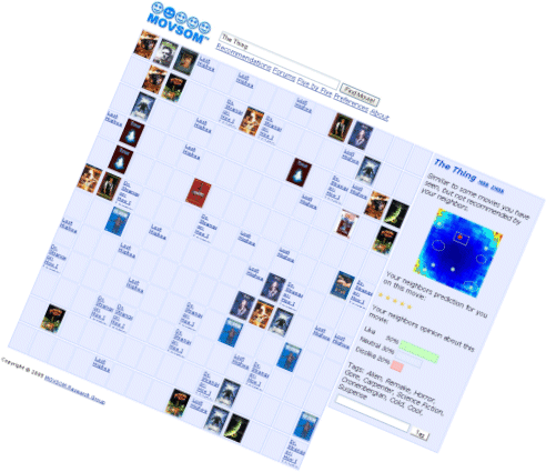
movsom Basic MOVSOM map, looking up the movie "The Thing" shows its position on the MOVSOM map and its surrounding similar movies. A two dimensional Top-N list, that encourages exploration of recommendations.