Chapter 6 - Trust in recommender systems
The understanding and trusting of recommender systems as well as the design of the user interface has emerged during the last years as one of the main focuses on recommender systems. Previous research has been focused mainly on the algorithms behind the recommender systems and in particular their accuracy as prediction algorithms. Studies [herlocker00explaining] , [sinha02role] have shown that the role of transparency in recommender systems improves the users understanding and acceptance of the recommendations. Explanations provide transparency by exposing the reasoning and the data behind a recommendation. The overall effect of transparency is that a user gains trust for the recommender system, which is an important concept in any recommender system. In MOVSOM transparency is achieved on many levels, text and graphical explanations are made for each prediction as well as visualization of user's neighborhoods and movies similar to each other. Another important aspect of the interface is how the user interacts with it. For example, is it designed for the purpose of encouraging users to explore and develope their tastes or for guiding people directly to items they would be interested in buying immediately? What overall features leads to satisfaction with recommendations? Studies regarding these questions and many more have been done by [swearingen02interaction] . MOVSOM supports different user needs, visualization of recommendations in a map like landscape is supposed to encourage the user to further explore new movies and well motivated predictions is there to help the user to choose the right movie according to his taste.
Whenever there exists some form of uncertainty that makes something risky, trust usually becomes an issue. In recommender systems this can happens when recommended items are unfamiliar to the user or when the user can't figure out why he receives the kind of recommendations that he gets. Although the highest risk the users take in a movie recommender system is to spend a couple of dollars on a bad movie, there are domains in which the risk factor would have a crucial impact on the users decision in trusting a recommendation, e.g. recommender systems in health or financial domains. This is also one of the reasons to why recommender systems have trouble making its way into such high-risk content domains [herlocker00explaining] . A user gains trust in a recommender system over time if he has a positive experience of the recommended items. If the experience is negative, uncertainty towards the systems ability of making good recommendations will start to grow.
Transparency of recommendations
One method for maintaining trust and decreasing uncertainty is to implement transparency into the system in such a way that the user knows how the system comes up with the recommendations and why he should trust the recommendations given by the system.
Users like to know why a particular item was recommended to them, because that makes them feel more confident about the recommendations. This was also the main result of a user study conducted in the paper [sinha02role] . They also reported that users find this important even for items they already like, indicating that users are also looking for a justification of the reasoning behind the recommendations. How well a user understand the systems reasoning behind a recommendation depends on to what degree the system has implemented transparency, i.e. understanding of the system logic. If a user clearly can see the link between the type of input they give to the system and the corresponding output, i.e. the recommendations, the system has high transparency [sinha02role] . This also means that a user is able to better refine his recommendations by revising his input to the system, since he can see which parameters that are effecting the recommendations. There are many ways for the system to implement transparency, in [herlocker00explaining] they suggest that explanations (e.g. "since you rated x high, we recommend y"), predicted ratings (e.g. "based on how you have rated x, we think you would rate y with four stars out of five") and recommending a few familiar items (e.g. items or closely related items to which the user have had positive experience with) all are effective ways of increasing the systems transparency from a user perspective. Predictions alone can be considered as a high-risk feature [swearingen01beyond] , since a system needs to have a very high degree of accuracy for the user to benefit from it, hence predictions should always be made in the context of explanations to cover for imprecise accuracy. MOVSOM always explain the predictions and if no prediction can be given, explanation for that is given as well. Including familiar items among the recommended items seems to also have a trust-generating effect [swearingen01beyond] , as long as they are not to directly related to the kind of information that was fed to the system by the user as input to be used in the recommendation process. The previous experience of these items and the impression that the systems knows you personally can be one explanation for this effect. In MOVSOM, recommendations are tagged as familiar, neutral and serendipitous, allowing the user to judge for himself what kind of recommendation he is in the mood for.
Explanation of recommendations
If a user can figure out why he have received a particular recommendation, he can better judge if the recommendation is based on accurate information or not. One paper that deals with this question is [herlocker00explaining] , in which different ways of explaining recommendations with the help of graphics and commentaries are investigated. A user study was conducted in which the users were presented with twentyone different explanation interfaces. Each explanation interface contained one recommended untitled movie and each user was told to rate that movie according to the explanation of the recommendation for the movie. To their surprise, it wasn't the explanations that contained the most information that was preferred by the majority of users, instead they preferred more simpler explanations. Examples of these are shown in [explanation interface] .
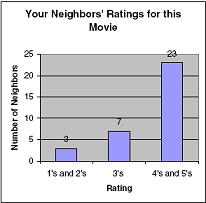
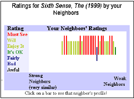
explanation interface Expert users was found to prefer the explanation interface to the right while the majority of the users, i.e. ordinary users, preferred the more simpler one to the left.
Another paper [bilgic05explaining] argues that the approach taken in [herlocker00explaining] only measures how well the explanation promotes the recommended item, i.e. convinces the user to adopt the item. They suggest that instead explanation interfaces should not only be selected based on how good they are at promoting items but also on what the users really thinks of the items after they have tried them out, which they refer to as the user satisfaction of the recommended item.
Three different explanation interfaces were tested; neighborhood, keyword and influence based. The keyword based explanations consist of the keywords in the user profile that had most influence on why the item was recommended [keyword explanation] . The neighborhood style explanation uses the opinions of the users neighborhood in the explanation for a recommended item, as depicted in [neighborhood explanation] . The influence style explanation explains the recommendation by telling the user how his interaction with the system has led to this recommendation, it does so by showing a table that explains what had the most impact on the recommended item [influence explanation] .
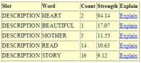

keyword explanation The keyword style explanation. By clicking on explain the second picture appears, revealing where the keyword appears. Rating is the user's rating for that item and count is how many times the keyword appears.
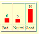
neighborhood explanation The neighborhood style explanation.
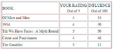
influence explanation The influence style explanation
In order to compare these method to each other, they designed a user study in which thirtyfour users were told to first rate an item according to the explanation and then try it out and rerate it according to what they really thought about it. The difference between these two ratings was measured and the explanation system with the minimum difference would be considered the best.
Their result from this user study shows that the keyword and influence style explanation was most satisfactory (almost identical) and that the neighbourhood style was least satisfactory. From the promotion perspective of explanations, the neighborhood based style performed best, people clearly overrated items that were explained by how their neighbors thought of them.
These two studies clearly shows that explanations have influences over how a user will judge a recommendation. Users seem to prefer the opinions from their neighbors, which both studies show, but the second study also shows that it is very likely that the users have too much faith in others opinion. Additionally the second study shows that the promotion ability of a recommendation is not good enough, it should also let the user assess the true quality of the recommended item. In MOVSOM, explanations either encourage the user to explore the items further or explain why they should be avoided.
Interactive design of recommender systems
Two important questions that must be considered in designing a highly interactive user interface is what user needs are satisfied by interacting with the system and what specific system feature leads to satisfaction of those needs [sinha02role] . Interaction with a recommender system usually means that the user provides information about himself as input, the system processes that information and generates an output of recommendations that usually are displayed as a ranking list with some explainations about the reasoning behind these recommendations. Some findings made in the study done by [sinha02role] suggests that users must be allowed to explore the given recommendations, refine recommendations e.g. rerate them or exclude/include new information into his user profile and have access to detailed information about the recommended items. Users also seem to be more willing to provide more information about themselves if it leads to better recommendations. MOVSOM has a clear and well defined goal; it should be fun to search for movies, both new and old ones. The process of rating and seeking out similar movies is taken into a new dimension, instead of the commonly used one-dimensional lists of movies ranked by some parameters, MOVSOM visualizes similar movies on a two-dimensional map, making rating and exploring of movies more intuitive and funnier. Users with a need of quickly locating movies similar to a certain movie are supported by the basic MOVSOM and users that want help in deciding if a certain movie is in his taste are supported by Personalized MOVSOM.